.svg)


How to use the F-pattern to make shoppers love your upsells
How to use the F-pattern to make shoppers love your upsells
The F-pattern is a simple layout design that follows the natural way people scan information. English is read from left to right, so naturally people start reading at the top left.
An email example
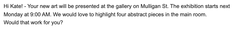
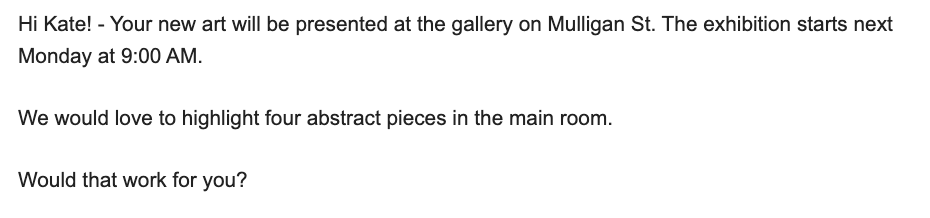
Notice the ease of reading the text and understanding the logical next step? The idea is to implement this design in your website, emails and also your upsells.
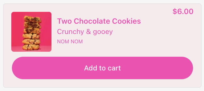
We want to avoid having a block of text. It overwhelms the shopper. We recommend using an F-pattern for your upsell copy.
An example:
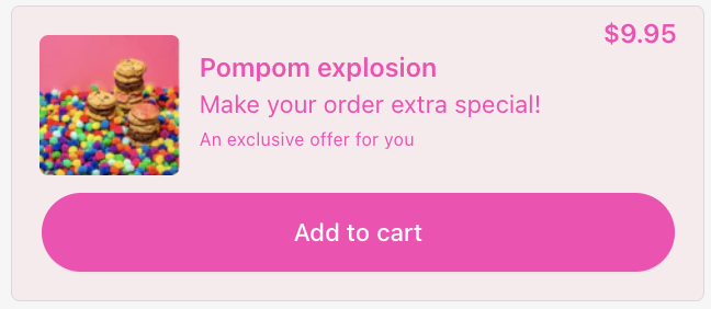
The F-pattern guides the shoppers eyes to the add to cart button. It looks and feels like the logical next step.
Need help designing your upsells? Reach out to support@upsellplus.com for a review by our in house UX designer.

Jaap Vergote
Need help implementing this?

.svg)
Related Strategies

.svg)

While Supplies Last: 3 Methods to Create Urgency and Scarcity on Your Store
.png)
Ready to start growing revenue?
.svg)
.svg)
.png)


